Welcome to undefended / undefeated, Sara Hendren’s newsletter — especially all of you new subscribers who signed up after hearing my conversation with Krista Tippett on On Being. This newsletter covers design, education, disability, and related ideas, and it comes out seven or eight times a year. Head to the bottom of this post to unsubscribe.
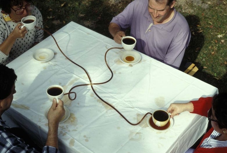
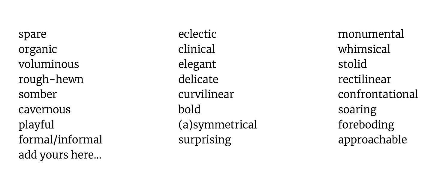
How do you describe the design of the stuff all around you, beyond what you like or don’t like, beyond what’s interesting or cool or boring? Next semester I’ll be teaching a class called Writing About the Built World. We’ll examine a mix of academic and journalistic criticism — for architecture, design at all scales, and technology — and we’ll look for analysis of objects and environments in all kinds of unexpected places: podcasts, movies, fiction. We’ll practice finding the most precise language we can for all the stuff that’s around us, the better to both cultivate our own sensibilities and to see the choices designers make as choices — choices that could always be different. I usually offer a word bank to get students going:
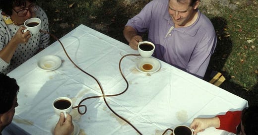
And I often start by looking at several projects that have meals and eating as their subject, orchestrated in very different ways, as a lesson in contrast. For example:
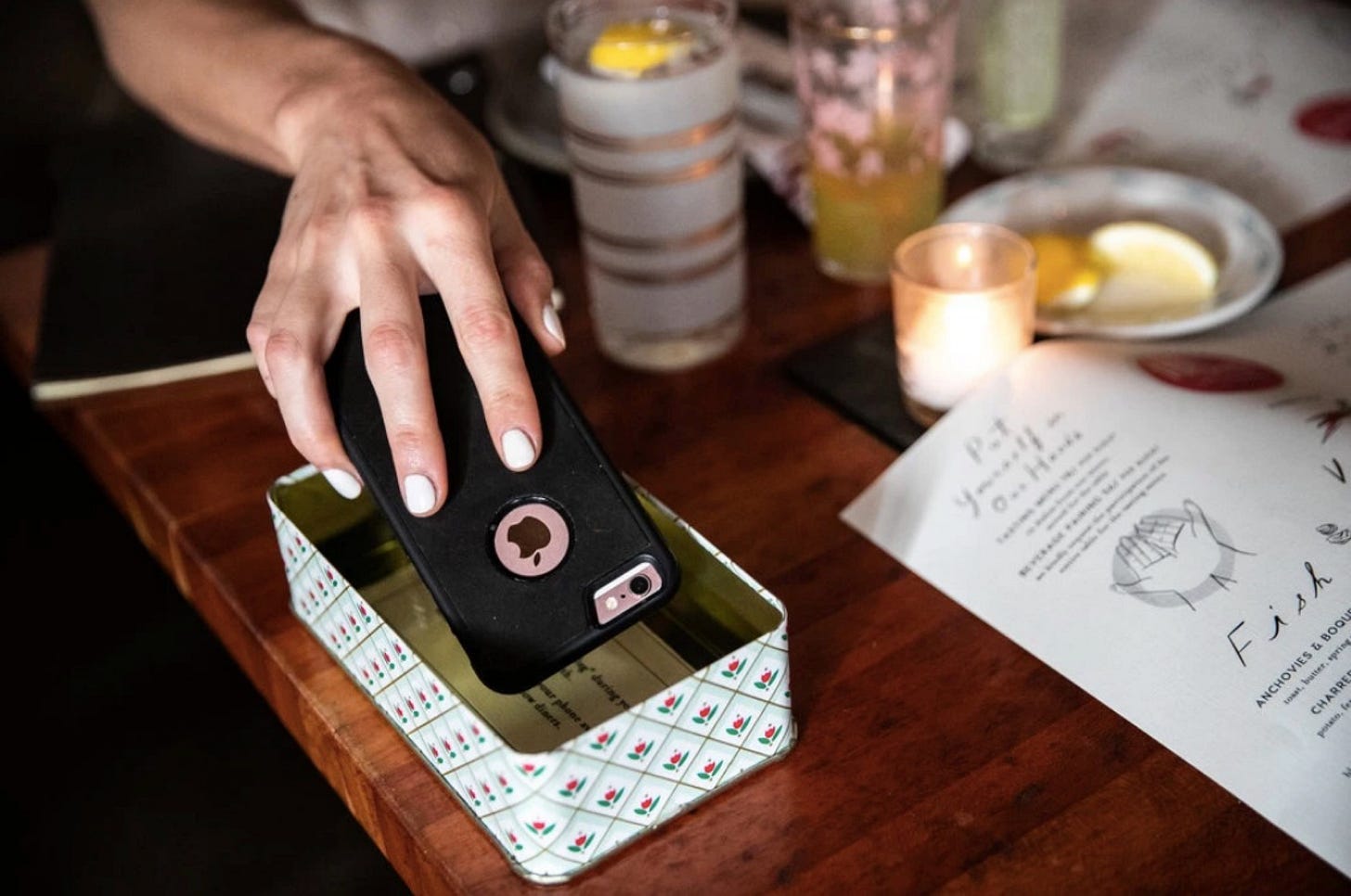
The Manhattan restaurant Hearth, in the early days after they opened, had a box on every table like this to invite diners to keep smartphones out of their mealtime. How would we talk about this arrangement of choices? It’s a suggestion, not a policy, and the container is open, not closed. The box is embossed tin and printed with a demure floral, like something from the 1920’s—not an armed safe, and not a bag for the coat check. Is this a subtle, nostalgic nudging? Is it an elegant escape hatch from digital life? Or is it paternalistic? Overly precious, even twee? Finding the words for this designed object-and-experience helps you figure out the assumptions behind the choices and the origins of your reaction. Compare Hearth to something else:
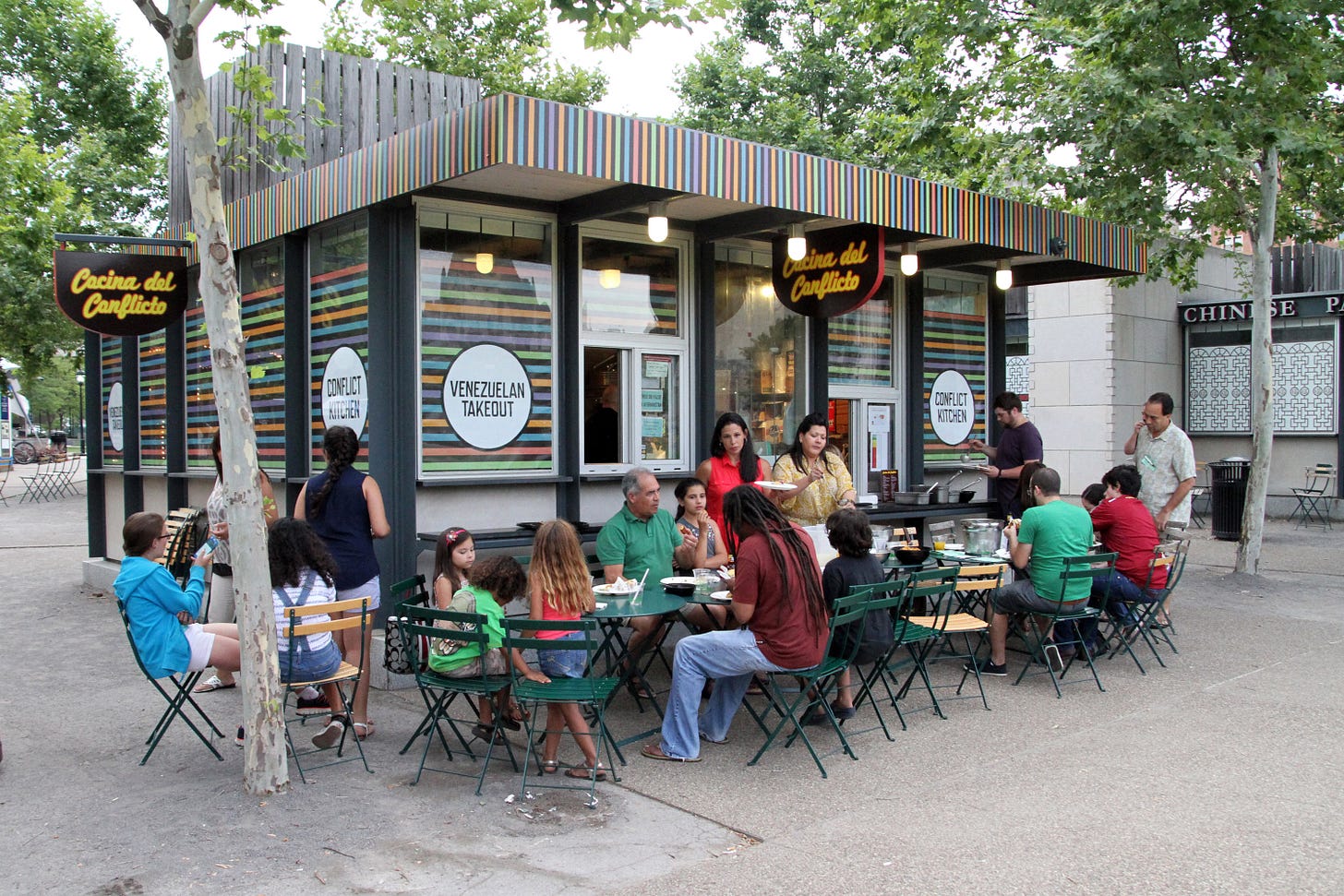
Conflict Kitchen, in Pittsburgh, serves food from regions of the world with which the US is in conflict. So they have programs and lectures and “lunch with an expert” on offer. But notice the design of the actual structure: it’s a trendy modern kiosk, heavy on stylish graphics, and the signage is just their name and the cuisine you can (temporarily) purchase there. So we might say this project leads with approachability — no protest posters or policy recommendations out front, as you see here — and follows with an invitation to more information, more provocation, if you so choose. A design group interested in politics could do otherwise, of course, with some aesthetic and programmatic changes. They could have decided to employ the confrontational, DIY graphic style of the handmade stenciled typeface. They could have printed menus with foreign policy demands on the back. They could have foregrounded the conflict part of the project, but instead they foregrounded the kitchen — the feasting, the conviviality, the enterprise. These are all choices, and it’s worth asking why. Now add another to the mix:
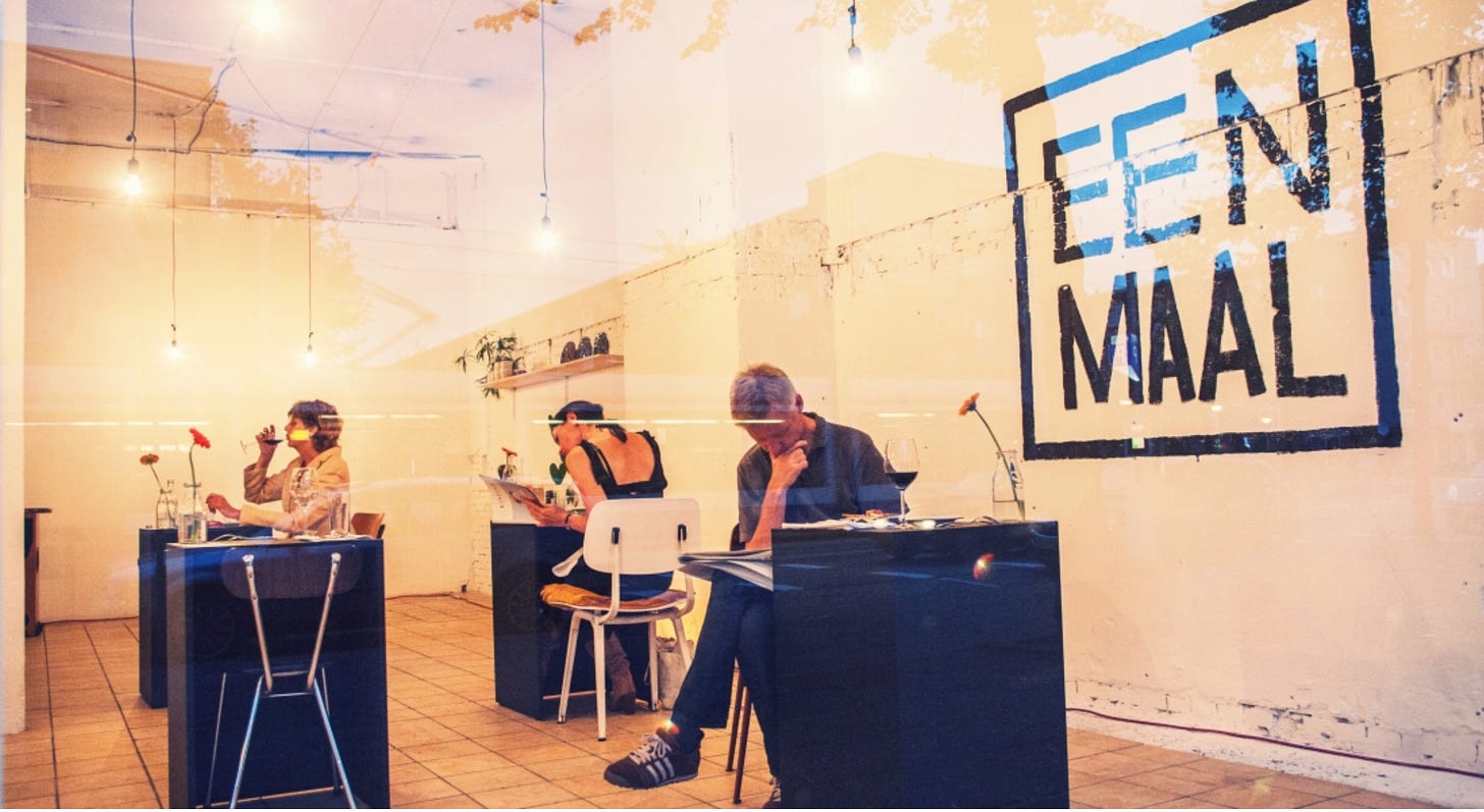
Eenmaal (pronounced “ayn mahl” in Dutch) means “one meal” — a meal for one. Eenmaal was a temporary project designed as an experiment in solo eating as the only option available, as you see in these single-setting black cubes above. The beauty of the project is its indeterminacy: is it a destigmatized way to go out to dinner unaccompanied? Or is it a foreboding commentary on loneliness and atomization? The stark black-and-white aesthetics mimic the austerity of the minimalist art gallery, and the name “one meal” carries a kind of ominousness. But the press coverage was mixed: maybe it’s the dystopian present, or maybe it’s the reinvented future. The ambiguousness is designed—intended as a question, held aloft and unresolved. Now add one more:
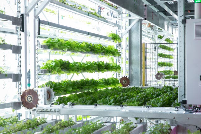
In Jackson Hole, Wyoming, and other cities in the United States, Vertical Harvest brings agriculture to urban environments by way of hydroponics: vegetable gardens that grow up, rather than out. They assemble an unusual mix for their social mission, seeking out underutilized spaces in cities, using high-tech systems for cultivation, and employing people with physical and developmental disabilities in what they call a “grow well” model of making both food and jobs. Vertical Harvest is a pragmatic approach to urban agriculture, with an optimistic use of fast technology and slow investment in historically under-employed people. There’s a provocation here, but it’s not like Eenmaal’s enigmatic and haunting vibe. Vertical Harvest is a solutionist recombination of old and new.
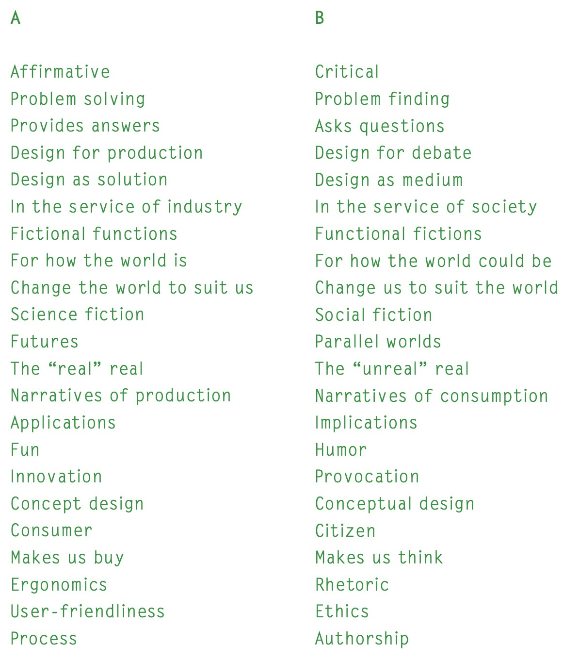
My students in design pick up the skills for a strong sense of agency. Design is inherently forward-looking — it’s driven by proposals, by what-if questions, by the intentional arrangement of parts, people, and interactions in a hundred possible variations. I want them to have more words for the responses they have to others’ work, but also to recognize just how many choices they have as they make things of their own. One reliable A/B test helps distill the matter in class, and that’s Fiona Raby and Anthony Dunne’s comparison list from Speculative Everything:
After showing them the projects like the ones I’ve laid out above, I often ask students to choose a disposition from this A/B scenario. Not as a commitment, but as a temperature-taking exercise. Are they A-trained, but B-curious? And so on. Design does lots of things, and the word bank is a way of opening up new vistas when students are stuck.
Thanks for reading. I’ve got a reported piece in the December issue of Harper’s, about a radical and imaginative partnership between professional artists and adults with cognitive disabilities at a day center outside Edinburgh. Intelligence, authorship, eugenic histories, and the beautifully inefficient vitality of making art as an encounter between people.
I’d love to know what you think. There’s more to say about all that, and I will, soon. Wishing you a beautiful end to 2023 and plenty of new vistas opening up in the new year.


Such a beautiful. mind-expanding letter - thank you!
This is beyond cool! I'm sending it to one of my sons, who is an urban designer.