six verbs for accessible design
your idea probably isn't "universal"

I’ve heard versions of this question for years: What if the design moves we make to expand the access of our idea—our building, our app, our gadget of whatever kind—what if that expansion effort in one way accidentally diminishes access in another way? People are worried that their design isn’t universal—and therefore whether they should try to bring it to life in the first place. But making a more accessible world is a broad and shared horizon, not a checklist, and I want to suggest six verbs, in pairs of three, for giving texture and specificity to the things you might be trying to make. Should you seek to make your idea as barrier-free as possible? Yes, in principle. But a big horizon contains within it lots of posts and perches—lots of places to take up parallel projects that aren’t in an easy hierarchy of better-or-worse. For example:
destigmatize / celebrate

A whole line of research and development goes toward miniaturizing hearing aids—where the design value is to make the tech as diminutive and out of sight as possible. This is a destigmatization project: one to address the subjective reasons older adults are reluctant to take up this vital technology, for example (citing “cognitive anxiety associated with increased help-seeking”).

But there’s also a parallel celebration project happening in design, especially among the “out and proud” subcultures within disability rights activism. This hearing aid jewelry has lots of variations on it—where the design value mimics the logic of fashion and glamour. Think, too, of children’s cochlear implant technology, which very often comes augmented by a small plastic dinosaur or other colorful figurine. The point here is to celebrate (and yes, obliquely, thereby destigmatize) by enhancement and strong visibility.
Which motive between these designers is “correct,” more contemporary, more enlightened? This is a boring question. The much more interesting invitation here is to ask yourself: Who are my design partners? What is our collective theory of efficacy here? And when I set out to pursue my idea, do I have the humility to acknowledge these parallel paths taking place?
mitigate / accommodate

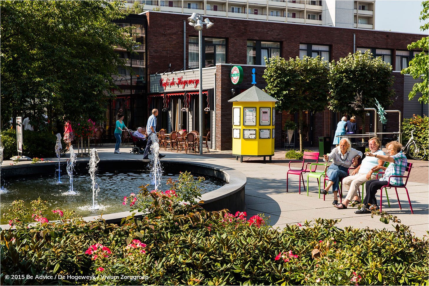
At the De Hogeweyk residence for dementia patients in The Netherlands, the built facilities form the simulacrum of a village: there’s a hair salon, gym, theater, restaurant, pub, grocery store, all operative and all dedicated spaces (as opposed to the bland and featureless “multipurpose room” in many elder care settings). These surroundings have strong placeful-ness in their sensory cues, which reduces the agitation and anxiety among patients there—a reassuring set of signals about where they are in space, which can be just as confusing as the slipperiness of time. Patients at sites like this seem to depend less on medication—which makes this design a mitigation project. It’s architecture, in part, as palliative care.
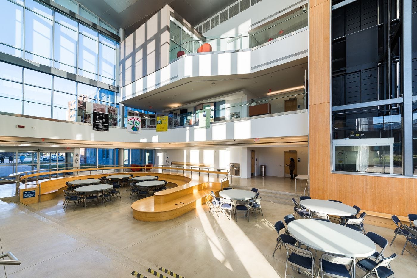
But contrast that with DeafSpace architecture, like at Gallaudet:

Here the logic is design to accommodate, not cure. DeafSpace is a codified series of spatial principles that help guide a building’s shape around deafness, rather than create the condition of hearing. So: long sight lines, in-the-round meeting spaces, hallways that end in a curve rather than a 90-degree point (the better to see folks coming around the corner), and much more.
automate / accompany

Design can also work as an automation effort—as in the ALS Residence Initiative started by Steve Saling, who has now-advanced ALS. Saling trained as a landscape designer, so when he got his early diagnosis, he both 1) watched the latest in medicine in hopes of a cure and 2) set out to design a sustainable life for himself with as much technologically-enabled independence as possible. With a small metal cursor perched on the nose bridge of his glasses, he can navigate the wheelchair-mounted tablet in front of him to activate text-to-speech, raise and lower the blinds, turn on and off his media, summon the building elevators. It’s the best use of automation, alongside a strong affirmation that life is worth living, even when our bodies change dramatically.
But what about that subtler thing—something both practical and affective, but more modest by far?

Inclusive design can also make new connections among people, often in simple moves. Speaking Exchange connected Brazilian high school students learning English with older adults in assisted living outside Chicago. The result was elegant and straightforward: matching an extant resource (adults with extra time and fluent English) with a best-practices pedagogical need (students looking to learn colloquial, extemporaneous speech). It’s technology for accompaniment, and getting it right is much harder than it looks.
So again: seek the universal? Of course, however close you can get. But assume that the world needs a whole riot of adaptive design at all scales—with sharply articulated motives and methods happening in parallel. Students, I say to you especially: be generous with each other while you seek your verbs and forms and topics. It’s a shared horizon, not a moral hierarchy. Look for all the ways you can both critique and repair. Think estuary, not tent.
Thanks for reading. For more along these lines, take a look at Elizabeth Guffey’s new edited collection called After Universal Design. It’s got a lot of ideas from great thinkers! I have an essay in there about speculative design where it meets disability—with some words from Carl Sagan, tours through the work of Natalie Jeremijenko and Krzysztof Wodiczko, and more.
I review David Gissen’s The Architecture of Disability in the new Landscape Architecture Magazine. It’s online today, here.
I’m teaching Design Tactics and the Human Body this fall at Northeastern. My friend Jarrett Fuller and I have been having an exchange about his “shearing layers” idea of design education.
The Cooper Hewitt’s Give Me A Sign show includes the icon project, if you’re in NYC this month.

I find thinking of these verbs in pairs interesting given the possible relations between them. The "destigmatize / celebrate" pair, for example, are somewhat in tension, as miniaturization efforts are designed to hide the need for assistance while hearing-aid jewelry strives to normalize the need for assistance. Other pairs, "automate / accompany" e.g., seem less in tension. Just an observation.
In any event, these pairs (and thoughts of universal design in general) bring me back to how we balance the fact that each one of us will need assistance at times in our lives with the fact that some of us live with disability in profound ways. Respecting both sides of that balance is a true challenge.
I think a lot about word usage and how we implicitly center or exclude with word choices. With your word pairs I appreciate the acknowledgement that we have many paths to solutions that work differently for different people.
I'm trying to think of something more optimistic or positive than "accommodate" to pair with "mitigate", though. Accommodation, from the ADA regulatory word, still somehow feels begrudging to me, as if the design solution is being squeezed in alongside the "real" thing and it's being done in response to a mandate, not as a starting point for design thinking. It feels pretty adjacent to "mitigate." "We'll accommodate your needs" for me doesn't capture the Gallaudet design that is absolutely grounded in the people in that building and what works first and best for them. Maybe "center" is the word I'm seeking.